Baskin Robbins
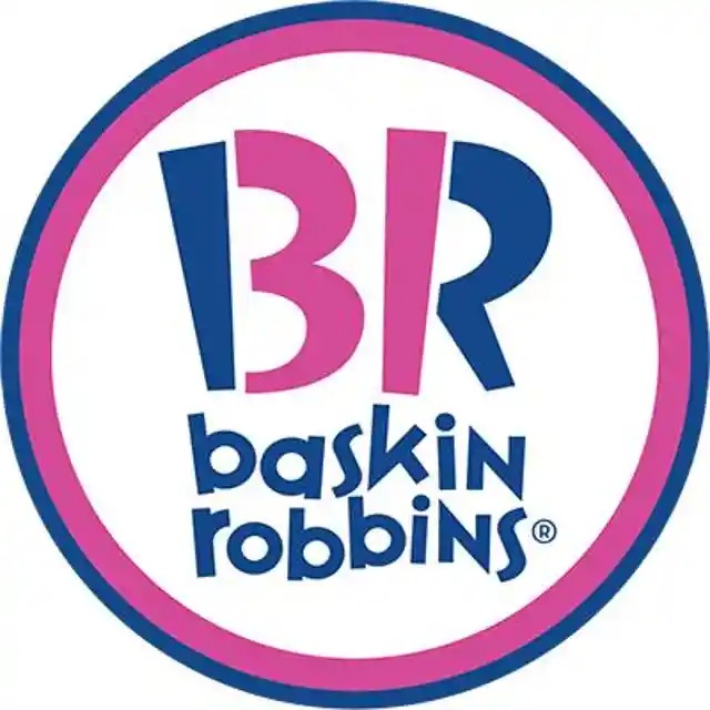
Take a closer look at the pink portions of the logo. Notice anything? Hidden within the letters “B” and “R” is the number 31, representing the brand’s famous variety of ice cream flavors. This subtle detail cleverly reinforces the company’s identity.
Tostitos
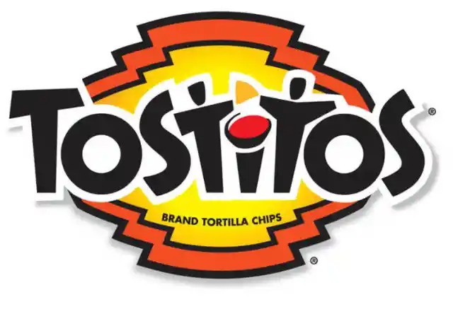
The two “T”s in the Tostitos logo depict more than just letters—they form an image of two people sharing tortilla chips over a bowl of salsa. This design element subtly communicates the brand’s message of bringing people together over snacks.
Amazon
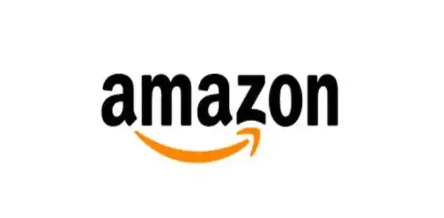
At first glance, the Amazon logo’s arrow looks like a friendly smile, symbolizing customer satisfaction. But there’s another meaning—the arrow extends from “A” to “Z,” representing the company’s wide selection of products, covering nearly everything one could need.
Sun Microsystems
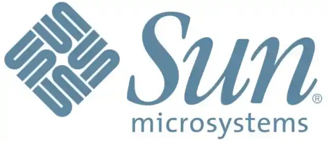
While many technology logos are straightforward, Sun Microsystems incorporated a clever optical illusion. The diamond-shaped symbol spells out “SUN” in every direction, making for a uniquely symmetrical design.
Spartan Golf Club
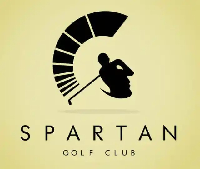
This logo is a visual masterpiece. Depending on how you look at it, you’ll either see a Spartan helmet or a golfer in mid-swing. The dual imagery reflects both the club’s theme and its target audience.
Pepsi
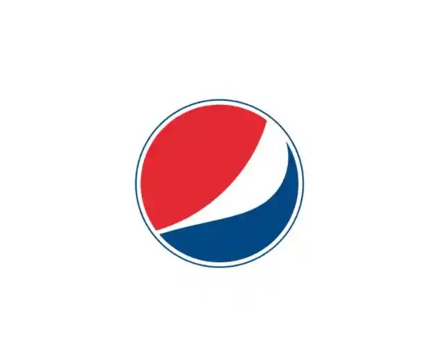
In 2008, Pepsi introduced a new logo, designed by Arnell Associates at a significant cost. A leaked document suggested that the logo’s design draws inspiration from concepts such as the Renaissance, Earth’s energy fields, and mathematical proportions. While some find these connections intriguing, others see it as an abstract interpretation.
McDonald’s
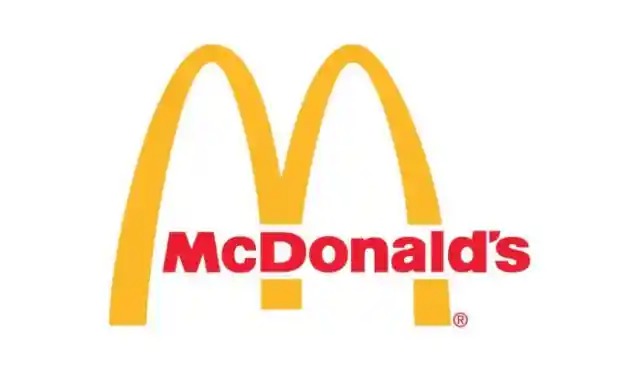
The golden arches of McDonald’s are globally recognized, and they were originally designed simply as an “M” for McDonald’s. However, some branding experts believe that over time, customers began associating the arches with a sense of comfort and familiarity, further reinforcing brand recognition.
Toyota
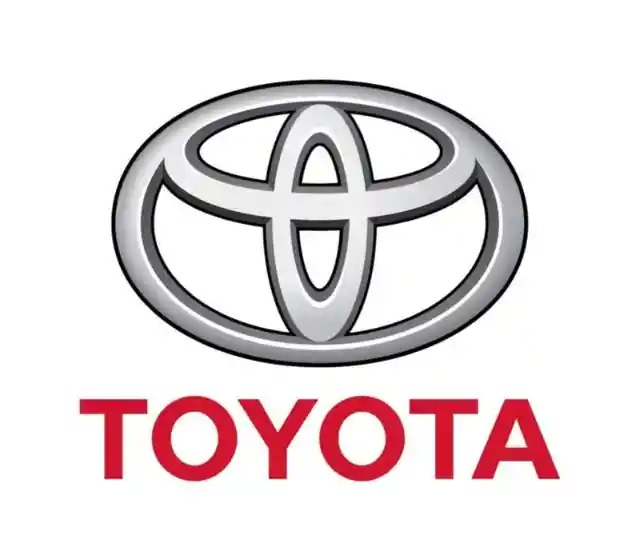
The three overlapping ellipses in Toyota’s logo symbolize three key aspects: the heart of the customer, the heart of the product, and the heart of technological advancement. The design also subtly incorporates every letter in “Toyota” within its shape.
BMW
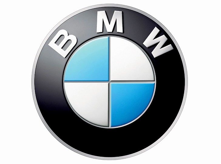
Many associate BMW’s logo with a spinning airplane propeller, linked to its history in aircraft manufacturing. However, its colors actually represent the Bavarian state flag. Due to restrictions on using national symbols in trademarks, the colors were rearranged to comply with regulations.
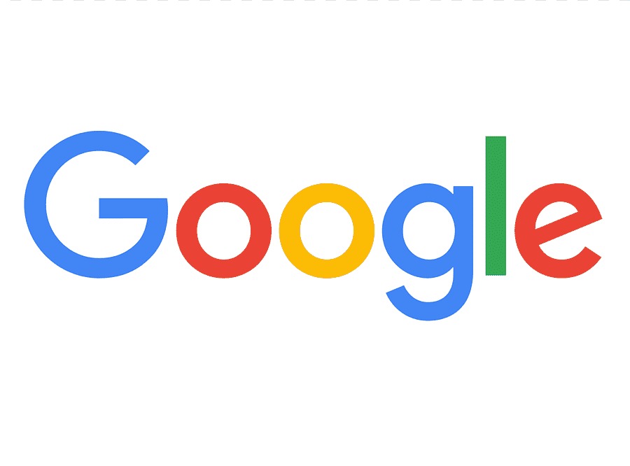
Google’s use of color is intentional. The first three letters follow a primary color scheme, but then, unexpectedly, the “L” is green, a secondary color. This choice was meant to symbolize the company’s non-traditional approach to design and innovation.
Wendy’s
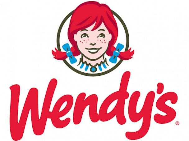
If you look closely at Wendy’s collar, you can see the word “MOM” hidden within the design. This subtle detail was intended to create a subconscious connection between the brand and the comforting feeling of home-cooked meals.
Coca-Cola
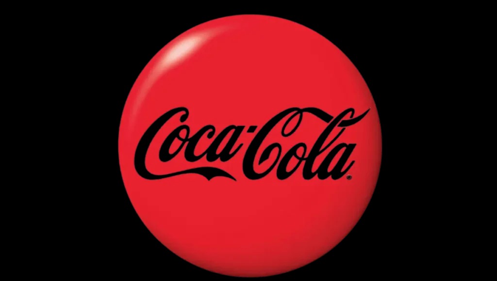
Hidden within Coca-Cola’s logo is an element that wasn’t originally planned—the “o” contains a shape resembling the Danish flag. Once the company discovered this, they used it in a marketing campaign in Denmark, known as one of the happiest countries in the world.
VAIO
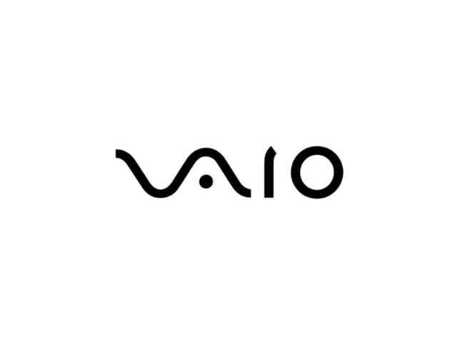
The Sony VAIO logo isn’t just a stylized brand name—it cleverly represents both analog and digital technology. The “V” and “A” form an analog wave, while the “I” and “O” symbolize the binary digits 1 and 0, linking the past and future of computing.
LG
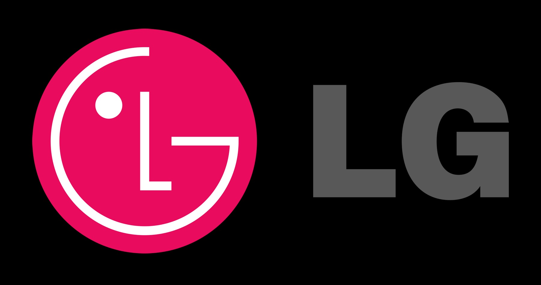
LG’s logo appears to form a smiling face, reinforcing the brand’s friendly and approachable image. The letters “L” and “G” are positioned in a way that creates this effect, making it a simple yet recognizable design.
Adidas
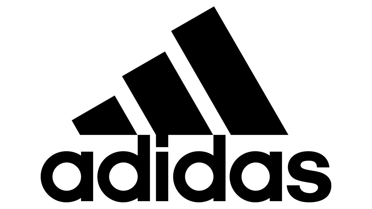
Originally, Adidas’ three stripes had no particular meaning. However, in the 1990s, they were redesigned to resemble a mountain, representing the challenges and goals that athletes strive to overcome.
Leave a Reply